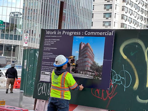
After a 10-month hiatus, foundation work restarted in the late summer ... when the developer, Real Estate Equities Corp. (REEC), received a $70-million loan for the project.
REEC plans on 53,000 square feet of office space and some 7,700 square feet for retail. The new rendering shows that version ... though the final look isn't too different from what was revealed several years ago...
As previously reported, a 10-story office building had been in the works here. In October 2020, the City Council's Zoning Subcommittee voted down REEC's application to transfer air rights from the landmarked 4 St. Marks Place to the new building across the street.
With the air-rights transfer, REEC would have been allowed to build 8,386 square feet larger than the current zoning allows.
The building, officially 1 St. Mark's Place, is slated for a July 2024 completion.


Hideous
ReplyDeleteRather nice looking design. The setbacks, use of brick, curved corner, and added greenery are a hell of a lot more appealing the usual glass box.
ReplyDelete"1 St. Mark's Place" - nah, more like ZERO St. Mark's place, IMO.
ReplyDeleteWhat a lack of imagination this design displays. Is this stuff only designed by people who use standardized "blanding" software?
This thing is somewhat of a victory for the neighborhood. As mentioned in the story miraculously the City prevent a developer scam to graft air space and add it here. Remember it was Di Blasio who lead the charge to make the East Village part of "mid-town south", and it was Carlina Rivera who was happy to go along with it. At least one of them is gone from our city's government.
ReplyDeleteGee, just what NYC needs, more office space.
ReplyDeleteWhy do people hate shitty old crumbling buildings being replaced by nice new ones? I don’t get it
ReplyDeleteNeither do I???
DeleteAgree with @XTC for the most part. The tapered ice cube tray look is an improvement over the traditional brutalist max square footage ice cube tray style.
ReplyDelete@1:26 PM Gotta wonder if there's an office space washout coming. If so some banks will take a hit and some projects will be unfinished for a while. Real estate is a long game.
This building looks like an exact replica of the one on the NW corner of Bowery & 4th, which I recall EVG diligently documented.
ReplyDelete@5:03pm: "Shitty old crumbling buildings"? Maybe you're living in the wrong city! Try Singapore; I understand everything there is pristine and modern and sterile!
ReplyDeleteIf you can't appreciate old architecture or the history of a neighborhood (which is what makes that a "desirable" place for this new building to be located!), then you simply don't "get it".
What was there was the continental bar and McDonald’s which were 100% shitty crumbling buildings. I appreciate good architecture but that wasn’t it
Delete@5:15- So the style you're referring to is not actually *brutalist*, but *modernist8 as in modernist glass box aka the *international*. Brutalism is quite different and very much more severe looking- typically masses of raw concrete as opposed to a glass exterior. Far more common in east Europe than the US.
ReplyDeleteWhat would have been cool is if they had commissioned Jim Powers?, the EV mosaic guy, to do an installation. The building is ok for what it is but the ground level could use some kind of proper funky street vibe finish.
@XTC - You are correct. I was flippantly using "brutalist" as an esthetic judgement not as at a reference to Soviet or post war British concrete boxes. I don't find all "modernest" architecture brutal but never liked the severe tall ice cube trays. The curved corners plus setbacks on the new midtown skyscrapers are a big improvement.
ReplyDeleteAs for hiring Powers? Sure, why not. Though the Zeitgeist is currently CVS and ATMs so I doubt commercial real estate sees any ROI in adding flavor.
@8:21PM: That is a GREAT idea re: Jim Powers!
ReplyDeleteThat'd go a long way towards making this building actually fit into the neighborhood. I'd love to see someone commission Jim to do an installation!
A way to convert the glut of office space in Manhattan to housing would be to change the zoning that requires bedroom windows: https://www.slowboring.com/p/to-save-downtowns-we-need-to-embrace
ReplyDeleteBasically, the regulations requiring bedroom windows predate mechanical ventilation and electrical lights. When bedroom window regulation was passed, residential heating meant “burn coal in a stove in each room”. https://en.wikipedia.org/wiki/Old_Law_Tenement
Of course people would prefer windows over no windows given a chance, but also consider how often people have their bedroom curtains closed all day long. And windowless bedrooms may be less noisy as well.
#9:50am: Oh, yeah, real estate moguls would LOVE, LOVE, LOVE to see a change that said the legal definition of a bedroom (habitable room) no longer requires a window!
ReplyDeleteThink of the possibilities: Some apartments would suddenly have one or more extra bedrooms, so rents could go sky-high. Wheee!
And then, logically, why would a living room require a window either?
Heck, cellars could suddenly become marketable as multi-bedroom apartments.
Who needs air, anyway? I mean really, if it's 98 degrees out, just stay in your bunker.
PS: Even cells at Rikers have windows. Just sayin'
Sure would hateit if I had to break through a wall to escape a fire in the building.
ReplyDeleteWhat happened to the Blue Sky concept? None of these tombstones should be above 6 floors high. then a bad exterior would be mitigated. Its the HEIGHT that is the BLIGHT, not the architecture
ReplyDelete