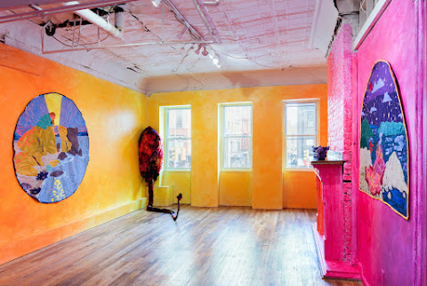
I was lucky enough to meet and chat with the artists about their processes, collaborative relationship and greater visual arts practices. "Anaphoric Fractures" runs until Sept. 3, and I highly recommend making an appointment to visit the gallery NOW.
Clare Gemima: First, congratulations to both of you for the success of "Anaphoric Fractures." I came to your opening, and it was packed right up until the sun had finally settled! How has the experience of watching your audience interact with your works been? Did you learn anything from opening night that you weren't expecting to?
Tilde Thurium: The reception has been overwhelming. I am profoundly grateful. Everyone I've interacted with has been curious about the process of producing these works. It feels like the audience understands the feeling I intend to convey.
Nicole Aptekar: It's been fantastic to see people's reactions to our work! I had a pretty good understanding of what it might be like, having shown at EV Gallery last October, but it was actually a somewhat different crowd than the previous show!
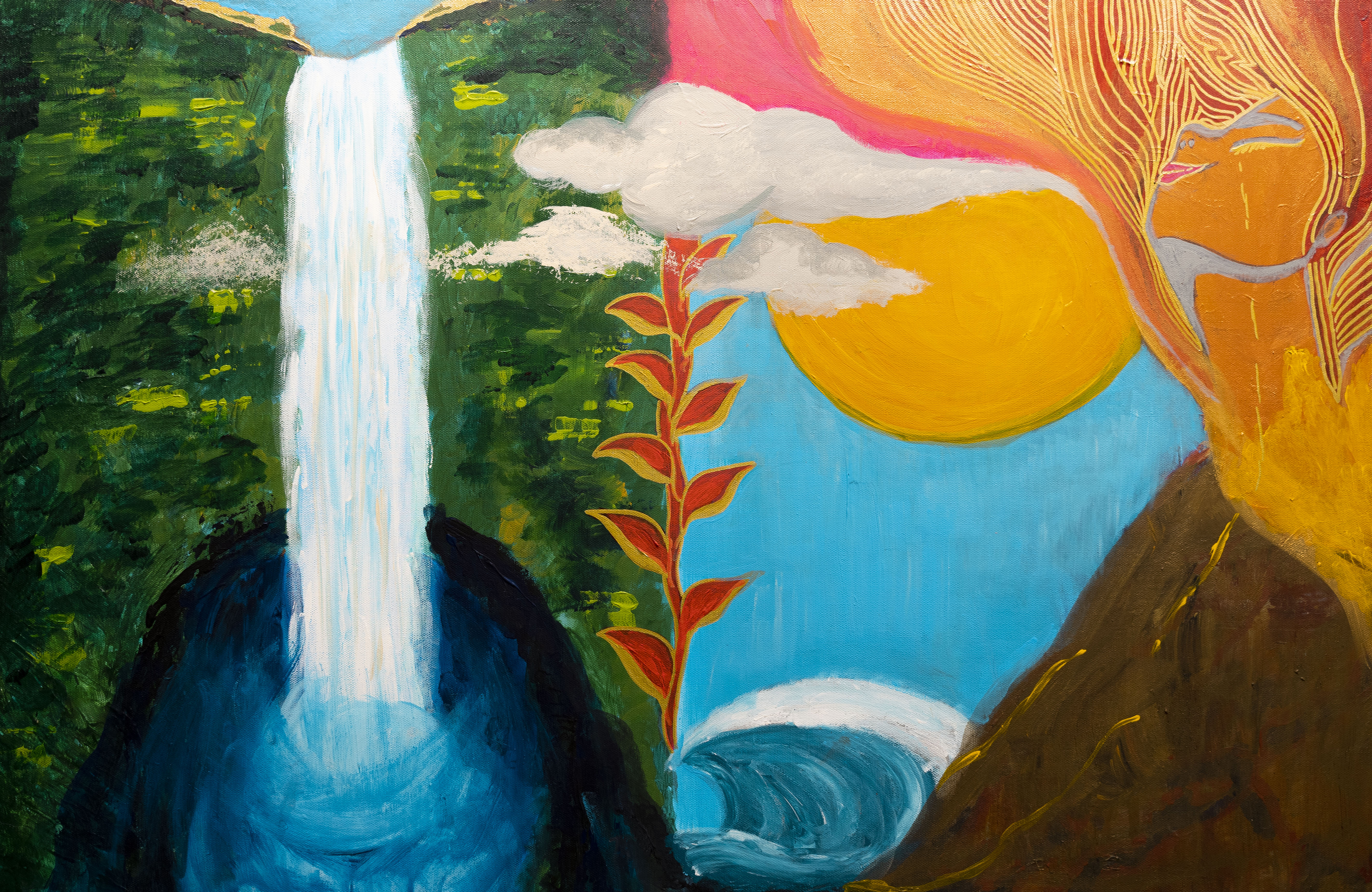
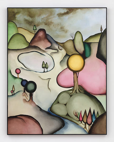
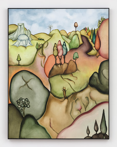
Lately, I've found that the most commented-on pieces are never what I expect they'll be. Given that we're making abstract work, hearing how people connect and interpreting them for themselves is really powerful and heartwarming to experience. One of the main things I took away is that my process perspective can mask how people will see the final pieces. In a number of the works for this show, there are curved lines extruded and twisted through the pieces, and to me, this geometry is used like variations on a theme. Still, to most people at the opening, the results were so different that they didn't connect them as explorations of a similar technique.
CG: How did you initially meet, and what attracted you to each other's unique visual lexicon?
TT: We met in 2011 at a vegan pizza place in San Francisco that has since ceased to exist. Nicole's work immerses the viewer in a geometric landscape; seeing her art, I felt an immediate resonance with my approach. Her style is more precise, and mine is more organic, but fundamentally we are both taking the audience on three-dimensional journeys.
Knowing Nicole has pushed me to become a better artist than I otherwise would have. I felt like she profoundly got what I was trying to communicate visually. She is a prolific creator, and her practice has inspired my own for many years, even before we made our first collaborative piece in 2018.
NA: We met way back in 2011! This was in San Francisco, just a few months before my first solo show, and I was working on an event with Gray Area Foundation for the Arts. I stopped at a tiny little vegan restaurant across the street on a break.
Tilde had eye-catching tattoos, we got to talking, and I soon found out that they were a painter. We started hanging out and have been friends ever since. We've helped out on each other's projects back in San Francisco and have encouraged each other's art practice. Both of us work in abstract, but Tilde's always been so colorful, and I've historically been so scared of color in my work. I worked exclusively in white until like 2017 or so, and since then, I've moved to black and metals like gold or silver.
I'm not entirely sure how we got the idea to blend our mediums together, but we started working towards a couple possible ways to do so in 2018. I've got some files from before we settled on the method we used in the show. I think initially, we were trying to experiment with etching construction lines into the wood, and having Tilde paint around them. I like our current process better.
CG: Tilde, you work out of San Francisco, and Nicole — you’re based in Brooklyn. Can you shed some light on how your collaborative dynamic operates long distance?
TT: When we first agreed to start working on Anaphoric Fractures, we talked through initial themes and colors we wanted to explore. We decided I would start the process and send the work to her as I finished. From there, I would send Nicole photos of works in progress. She would give suggestions from time to time, which were really helpful and pushed me to think about composition in a new way.
When a painting was done, I would mail it off to Nicole. Then she would start designing, cutting, and assembling the sculpture, which is much more labor intensive. Over the course of Nicole's work, she would send me renders and snapshots of pieces in progress. I would offer suggestions. The whole process was a reciprocal dialogue, one of the dynamics that inspired the show’s name.
NA: Well, the first piece we made didn't have the distance. I moved to Brooklyn in 2019! That said, I think working long distance actually works better for us. Tilde regularly sent over progress shots of the paintings as they came together, and we could discuss them at length and conceptualize how the paper sculpture might engage with the painted form long before it got completed. Then once it made its way over to me, I would do the same with iterations from my process. If I were local, I think that would probably just get saved for when we could meet up in person, rather than being a daily/weekly sort of thing. The final results would have been much more of a sequential handoff rather than a continuous collaboration.
CG: Each sculpture is accompanied by a body of poetic, stimulating, but also cryptic text. They have also all been given verse-form titles. How important has writing become throughout your collaborative process, and how is it intended to aid your audience’s overall interpretation?
TT: The titles help the viewer place themselves within an imaginary world. Nicole and I are both evocative writers, but our tones and rhythms are markedly different. We each wrote the text for half of the pieces, as it felt important to make balanced contributions to the show's written and visual aspects.
NA: The writing is a thing I've done since my earliest pieces. I used to be hugely embarrassed by it, but all of my sculptures have been 'inhabitable' in my head–they describe a scene in a world that's often fairly dark.
When I finish a piece, I sit with it and explore where in that world it takes place. The writing you're referring to is the result of that process, the description of that moment in the world of the sculpture, and I extract the title from the writing. For many years, after pulling out the title, I'd delete the writing; it just felt too personal to me! Some friends eventually convinced me not to, and starting with my previous show, I included it in the show. The reception has been so surprising; people seem to appreciate the words, even with how strange they are.
For this series, Tilde played along with my process and went through the exercise themself! We traded off who would write the longer moment of the piece and who extracted the title from it. It's remarkable to me how different our writing styles are for this process, but in the same way that the pieces feel natural and cohesive as one; the titles and texts all feel like they fit together.
CG: Each of the 10 works appears to be an extreme labor of love.
How long do these works take to create — from conception to installation, and what have you used to make them?
TT: I'm a very slow painter. I spend about 1/3rd of my time on a given piece doing small touch-ups, trying to make it as perfect as possible. I estimate I spent at least 20 hours on each piece.
NA: I'd say it's pretty variable on my end! There are pieces where the sculpting process goes really swiftly, with just a few variations and iterations, and ones where it's a lot more of a struggle to land on something I'm really happy with, with massive swings that engage with the painting in completely different ways or use totally different shapes. I'd say the longest time any one piece from this show took about three months.
And the shortest — about a week. I design my sculptures in Rhino, which is architectural CAD software. I've written some software to aid in my process over the 11 or so years of making paper sculptures, which helps me produce the work in a more reasonable amount of time.
Once the sculpture is designed, I use my own slicer software to get the 40 paper layers and then cut them one at a time with my laser cutter. If they have gold or silver embedded in the paper, that's an extremely manual process, so the cutting can take anywhere from a day to three or four if the adhesive and gold are uncooperative. Almost everything gets at least a once-over with an Exacto blade just for cleanup, and then the framing materials take me another two days on average.
CG: What is the most nerve-wracking aspect of crafting these sculptures, and at what point in production does it take place?
TT: On my end, a very procedural part: shipping the paintings off to New York in the mail! It's unlikely that they would get lost, but if they had, it could have been catastrophic.
NA: For me, once the paper is cut, there's only so much handling it can take before it stops looking 'perfect,' and there are often many steps still to come! The edges and spindly lines are quite fragile, and the gold/silver is tricky to have it come clean. I'm a perfectionist, and through working with the gold, I've had to tone those tendencies way down, as it's never going to be computer-render perfect, and that slight organic edge turns out to be a lovely contrast. The nerves calm down once I've finished photographing the work and sealed it in its frame; at that point, it's safe from me!
CG: What is the most rewarding part of being a visual artist exhibiting in New York City at the moment?
TT: Seeing people's expressions as they react to the work. Having engaging conversations with other artists and viewers who are curious about the process and enthusiastic about the results.
NA: It's been really meaningful to hear from folks that I'm helping bring back their experience, vision, and memory of a New York City filled with art and life after the truly rough first year of the pandemic. It's nice to have openings and see so much work in person again. I'm also really appreciative of how EVGallery engages with the street and neighborhood; the openings are as much outside as they are inside. It's just wonderful to interact with so many passers-by!
CG: Some of the visual techniques in each sculpture can be read as dichotomous — fluorescent, acrylic paint, webbed inside the monochromatic, cut paper.
Are these contrasting design choices deliberate or accidental?
TT: The material contrast is one element that makes these pieces work. The intense colors highlight the sculptures' depths and provide a strong focal point. The paper adds dimensionality to the flat paintings and provides the contrast that gives the work balance.
NA: I think that's one of the main forces that pushed us to work together. Our styles have some similarities but a lot of contrast, and it's satisfying to work to merge those differences together into a cohesive whole. It's a lot more challenging for me to work this way, but it's pushed me to experiment in ways I don't think I would have tried for years.
CG: Based on your distinctive and individual practices, how do the works in Anaphoric Fractures differ from what you would usually make in your studio?
TT: A few of these works are consistent with pieces I would produce in my solo practice. The rest diverge. Instead of abstract perspective blocks, I experimented with alternate geometric forms to give Nicole some liberty to layer over more of the paintings with sculpture. This experimentation has generated some themes and ideas I'm excited to incorporate into my solo work.
NA: My own works have a lot less color! Until this show, I'd only worked with black, white and gold. In my head, I've been dancing around the notion of adding color for probably five years, and this has been a good way to slowly test the waters of what that might feel like emotionally. As I said before, I've also experimented with many new techniques in this series, as it seemed like a safer space to do so. My individual practice is more methodical and controlled, slowly layering in new geometric primitives over the course of years rather than months. After some of these pieces, I feel like I have a lot to explore on my own.
CG: What are your thoughts regarding collaborations with each other in the future? Any exciting projects in the works?
TT: For "Anaphoric Fractures," I began all of the works, and Nicole then designed sculptures around the paintings. In the future, I would love to try making some pieces in the opposite order, where Nicole would design a sculpture that I would then create a painting around.
NA: I doubt that this is the end of us collaborating! I am excited to explore a few tangents I've been working on in parallel with this exhibit. After about a decade of hiatus, I've wanted to move back toward larger-scale installations again, and I'm hoping to find the right venue to make that happen.
Also, back in 2020, I had a residency at NYU's ITP. I have been working on paper sculptures framed with robotic armatures surrounding them to produce an even more kinetic experience for an object hung on the wall.
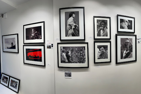
EVGallery, 621 E, 11th St. between Avenue B and Avenue C, is open Saturdays from 1-5 p.m. and by appointment. Find contact info
here.
~~~~~~
Clare Gemima is a visual artist and arts writer from New Zealand, now based in the East Village of New York. You can find her work here: claregemima.com. 
 Why is the show hung in salon fashion?
 What is the most successful photograph in the show?
 Which image holds the most sentimental value to you, and why?
 Who is your idol portrait photographer?
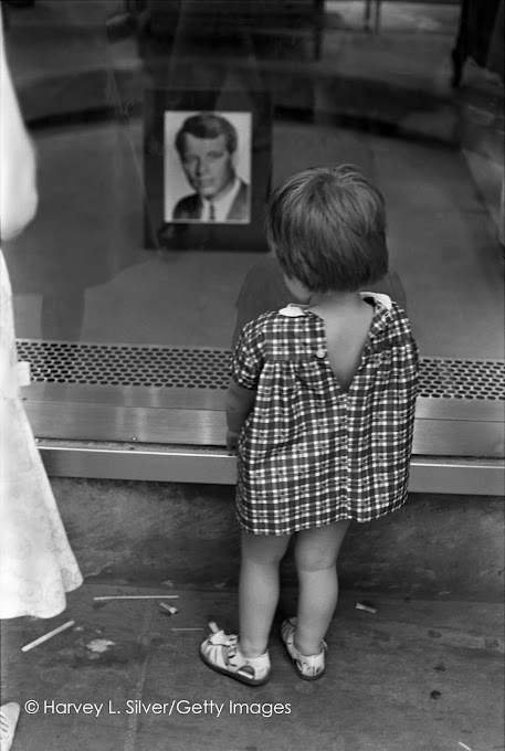
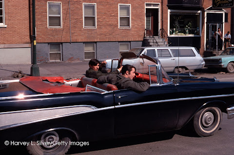 "Changin’ Times" runs through Jan. 14 at EV Gallery, 621 E, 11th St. between Avenue B and Avenue C. The space is open Saturday from 1-5 p.m. and by appointment (info@evgallery.art, 978-799-9014).